Likely the most confusing thing to get your early designer mind wrapped around is that your modelling software and the medium by which you present said model to anyone that is not you are widely different. One is a very capable tool with a lot of buttons that terrifies potential clients with its very business-like presence. Sorta how xbox sold very poorly in Japan: it just didn’t look very elegant. Sometimes when your rushing things to market, presentation is the last thing you want to think about, but it is the only thing that crystalizes the value of our product to stakeholders.
Unfortunately it all comes back to paper.
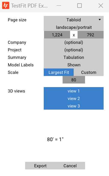
Efforts to automate the PDF feasibility report have left us with a PDF export that was used 33 times on average per day. (some 12,000 PDFs annualy) The copy-to-clipboard feature used 21 times, and a few other exports were used that I won’t get into (SKP / DXF / CSV). My suspicion is that the copy current view to clipboard is simply being used to paste images into an email or other publication software. Our PDF automated report doesn’t really give a whole lot of customization, but it is the most widely used report generator for site planning startups :). Here is the modal:

Right off the bat, the core problem I wanted to solve (relative to paper space in Revit or CAD) was to automate the scale (here it has largest fit) of the geometry relative to the paper size the user has specified (here it is Tabloid). The app makes an assumption based on users north arrow and site plan geometry to either have it be in landscape or portrait. In the past I spent an inordinate amount of time setting up views following that logic, and it has served TF well over the last four years. The rest of the modal is not that well thought out. We added “company” and “project” as basic customization, and gave the users the choice of keeping the basic tabulation or the more financially driven development one. Lastly we allow users to name custom views in 3D. If those are saved, they will show up here in this list. Once the report is generated, all views that are self-similar (like typical floor levels) are consolidated, so that information is never presented twice.
Now, our customers think it’s time to take “autopaperspace” into the configurator age. After topography, paper is our most requested feature.
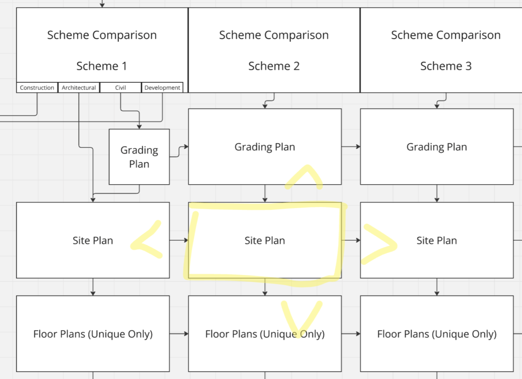
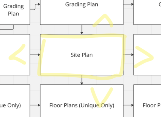
How we got here: I thought (incorrectly it seems) that sharing a link to a project was by far the most important thing. That web-functionality is frictionless. But that was making TestFit look good. It wasn’t meant to make our customers look good. And therein lies my own hubris? Ill keep pushing for mobile viewing and sharing, but at the same time, will push our team to build a far better paper space solution: A pdf you want to send to your friends. All I can think of is a pdf with left and right scrolling to the same analysis of a different scheme.

I’ve seen startups (and large corporates) use tldraw to great effect. Perhaps some whiteboarding tool and customer branding will serve us well. Perhaps generate a massive grid and allow people to color on top of it with annotations.
One things for sure: if we ever want to do DDs or more, we will need to figure out a far more co-creative way of doing sheets and sheetsets. Ill probably cover my thoughts on generating sets in a few months.
